Dashboard design
With our design guide to user-friendly dashboards, meaningful visualizations and data-driven decisions — in Power BI and Tableau.
Download the white paper for freeThe better a dashboard is designed, the more useful, clearer and easier it is to use and derive information.
Dashboards are the control centers of modern data work — if they are properly designed. Bad visualizations lead to misunderstandings and prevent quick decisions.
This white paper shows you how to optimize your dashboards with clear UI/UX, the right visualization methods, and practical examples from Power BI and Tableau. You will learn the differences and areas of application of dashboard types, receive ten central design guidelines and step-by-step instructions from concept to rollout. This is how pure data becomes valuable insights — understandable, interactive and effective.
This white paper shows you how to optimize your dashboards with clear UI/UX, the right visualization methods, and practical examples from Power BI and Tableau. You will learn the differences and areas of application of dashboard types, receive ten central design guidelines and step-by-step instructions from concept to rollout. This is how pure data becomes valuable insights — understandable, interactive and effective.
Four insights for creating user-friendly dashboards
Find out what makes a good dashboard.
Inquire now without obligation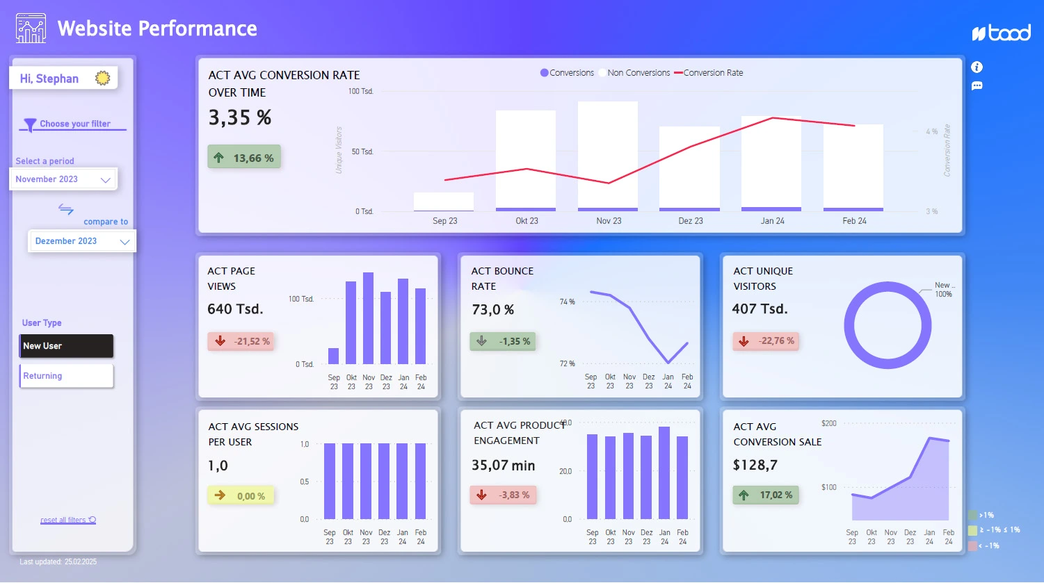
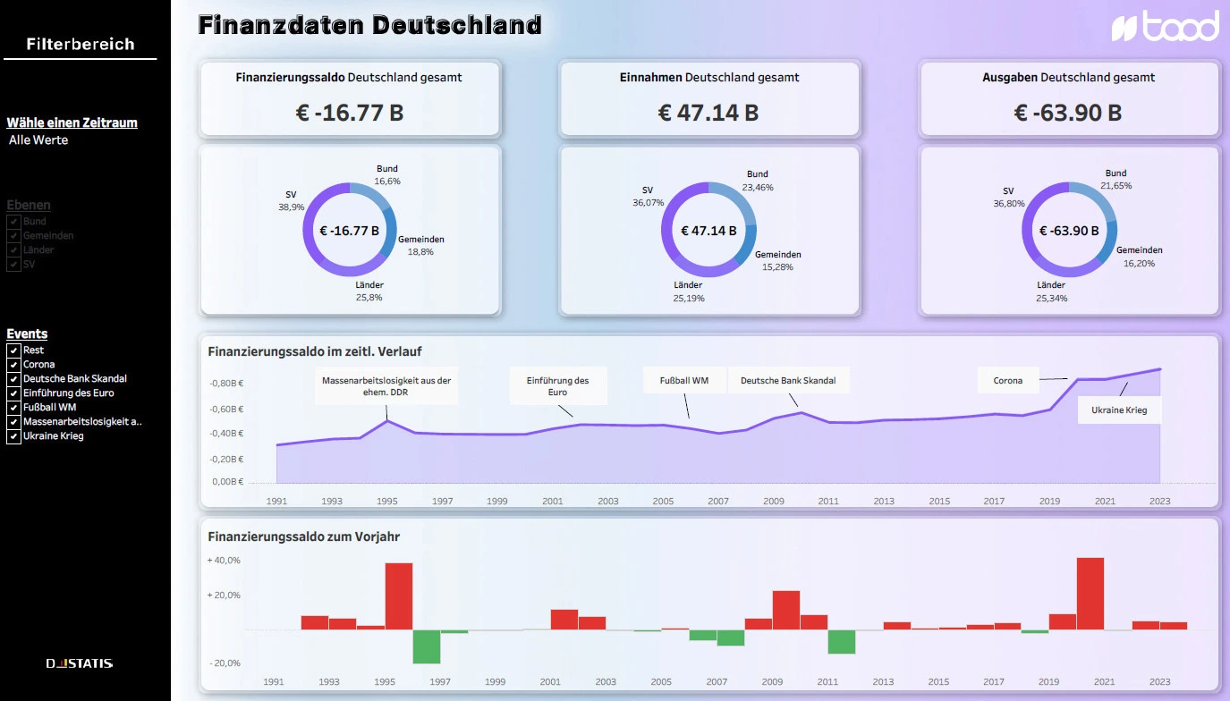
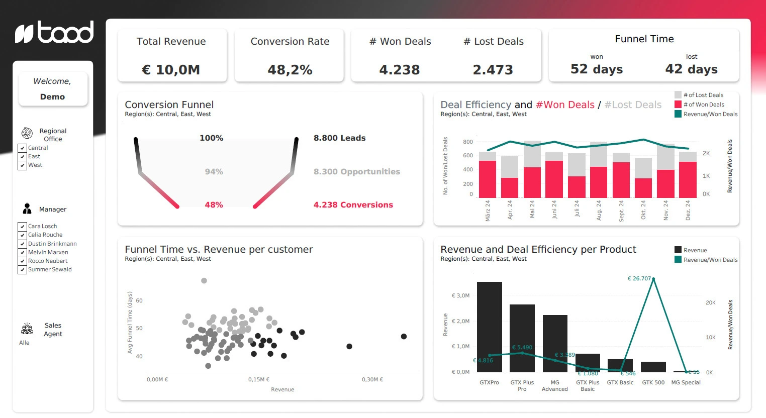
Dashboard types
Strategic, analytical or operational — what types of dashboards are there, how do they differ and when does which type bring the greatest benefit?
Design rules
The ten most important design best practices for clear, user-centered dashboards — from color selection and layout to interactivity and navigation.
Design workflow
From requirements analysis to wireframe to finished dashboard: step-by-step instructions for a structured design process.
tool tips
How Power BI and Tableau differ in dashboard design — with practical examples and recommendations for use.
Our technology partners for your modern dashboard


Your data expert and white paper author
.webp)
A dashboard is only successful if it delivers the right data to the right people at the right time.
Sophia Schubert
Head of Sales, taod
With her many years of experience in business intelligence & data analytics, Sophia pursues the goal of gaining clear insights from complex data and making trends visible. Her focus is on innovative approaches that make data effectively usable — for better decisions and a successful transformation towards data-driven thinking. Sophisticated dashboard design plays a central role for them in presenting information in an understandable, visually appealing and action-oriented way.
.webp)
Questions that will help you
FAQ
How is a good dashboard created from the idea to the finished product?
A good dashboard is created step by step, from the definition of requirements to conception and MVP development to the test phase and adjustment. Close coordination with stakeholders, tests with the target group and consideration of design, accessibility and comprehensibility are important.
What characterizes good dashboard design?
Good dashboard design starts with the needs of users and not with as much data as possible. Important features include a clear overview, useful drill-downs, appropriate visualizations, good navigability, clear design and a deliberate use of colors.
Why is user orientation so important in dashboard design?
A dashboard should help users answer specific questions and quickly collect information. Therefore, goals, requirements and context of use should be understood first before key figures, visualizations and layout are defined.
Learn more about dashboarding

Taod Academy
Analytics trainings
Individual trainings with your own data for analytics & AI.

Case
Dashboarding in marketing at Fresenius
Development of a central analysis platform and improvement of the data culture.

Service
BI & Data Analytics Consulting
BI solutions that provide orientation, establish trust in figures and really support decisions.
Stay up to date with our monthly newsletter. All new white papers, blog articles and information included.
Get exclusive knowledge for your data projects. In our print magazine data! Experienced data experts report directly from the world of data.
Data! subscribe